

Most people looking for a farm stay, local produce or a meat box are doing it on their phones. In fact, over 60% of website traffic now comes from mobile devices. Whether they’ve clicked through from Instagram or found you on Google, if your farm website doesn’t work well on mobile, they’ll quickly click away. A mobile-friendly website isn’t just a nice extra—it’s essential. Here’s why it matters and what you can do to fix it.
A mobile-friendly website is one that’s easy to use on a phone or tablet—not just a shrunken version of your desktop site. It should load quickly, display content clearly, and make it simple for users to navigate, click buttons, and complete actions like booking or buying.
That means no pinching the screen to zoom in, no tiny buttons that are impossible to tap, and no confusing layouts. Text should be easy to read, images should load properly, and contact forms or shop pages should work seamlessly on smaller screens.
It’s also about performance. Slow load times are a huge turn-off for mobile users—many won’t wait more than a few seconds before giving up. Google also takes mobile usability into account when ranking websites, so it affects your visibility too.
In short, mobile-friendly means smooth, fast, and frustration-free—exactly what your customers expect.
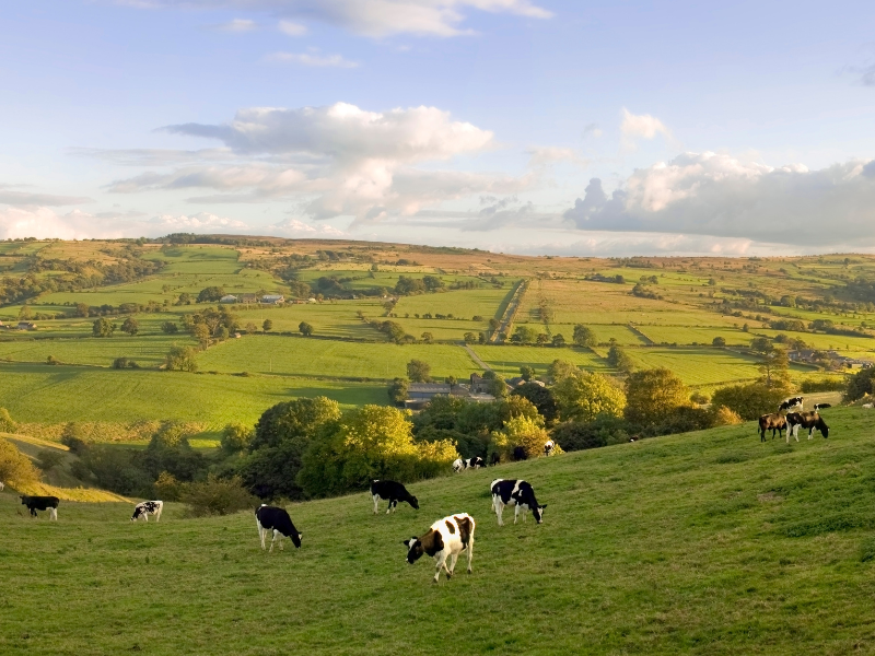
If you’re running a farm shop, glamping site, or meat box delivery, your customers are often finding you while they’re on the move. That might be a foodie scrolling Instagram on their lunch break or a parent searching for a weekend getaway while sitting on the sofa. If your site doesn’t load properly on their phone, they’ll likely give up before they even see what you offer.
For diversified farm businesses, your website is often the first impression. It needs to be welcoming, clear, and functional—especially on mobile. Customers should be able to browse your products, check availability, or place an order without hassle.
We’ve seen this firsthand. For example, improvements to user experience helped one of our on-farm butchery clients boost Instagram engagement and increase retail sales. A mobile-friendly site isn’t just about tech—it directly impacts your bookings, orders, and income.
Making your website mobile-friendly isn’t just about shrinking it down—it’s about tailoring it for how people actually use their phones. Here are the essentials every farm website should include:
Not sure if your website works well on mobile? The easiest way to check is to try it yourself. Open your site on your phone and ask a few key questions:
You can also use free tools like Google’s Mobile-Friendly Test to get a quick report. It’ll highlight any issues and suggest what needs fixing.
Better yet, ask friends or customers to test it and give honest feedback. They might spot things you’ve overlooked, especially if they’re not familiar with your site.
Even small improvements—like adjusting button sizes or removing a slow-loading slideshow—can make a big difference to how people experience your site on mobile.
Optimising your farm website for mobile doesn’t have to mean a full rebuild. Often, a few simple changes can make a big difference:
Switch to a Responsive Theme
If your site runs on WordPress or similar platforms, check that your theme is fully responsive. Most modern themes adapt automatically to different screen sizes.
Resize and Compress Images
Large image files slow things down—especially on mobile. Use free tools like TinyPNG to compress your photos without losing quality.
Simplify Your Menu
Too many options can overwhelm users. Stick to the essentials: Home, Shop, Book Now, Contact, About.
Add Big, Clear Buttons
Make your key calls to action—like “Buy Now” or “Book Your Stay”—easy to find and tap with a thumb.
Move Key Info ‘Above the Fold’
On a phone screen, users see less at once. Make sure your most important info appears right at the top: think opening times, offers, or booking links.
These small tweaks help customers stay longer, buy more, and come back again.
If your website feels out of date or just doesn’t work well on mobile, now’s the time to sort it. A few simple fixes might do the trick, but if your site is more than a few years old—or if you’re planning a new diversification project—it could be worth calling in some expert help.
At Flame Marketing, we’ve supported dozens of farm businesses with everything from website updates to full marketing strategies. Whether it’s making your glamping bookings easier, boosting meat box sales, or simply helping customers find your opening hours without frustration, a mobile-friendly site can make a real impact.
Remember, your website is often the first impression people get of your farm—make sure it’s working for you, not against you.
If you’re not sure where to start or need a second opinion, we’re happy to help.
👉 Book a free strategy call with us here and let’s chat about how to make your website work better for your business.